
We define as color contrast any situation in which two colors are completely opposite and “contrast”, that is, the difference between the two colors is very noticeable.
When two colors contrast, both colors will immediately attract our attention, since when we see completely opposite colors, our brain will react by clearly fixing those two colors. An example is in people who wear contrasting colors, which attract more attention than people who wear colors that are very similar.
In art, the tactic of creating color contrasts is very effective, since in this way we get whoever looks at the work to look more at the area where the colors contrast. For example, a person dressed in a black suit and white shirt and a light background is going to attract more attention than a person in a completely blue suit on a blue background.
Bringing color contrasts to your works can make your work as an artist recognized, since in this way you will be able to create works that attract more attention and, therefore, are more pleasing to the eyes of other people.
The bad thing is that not everyone knows how to create color contrasts, since colors do not always work in the same way and people do not always know how to combine them as they should. If the colors combine well, we will achieve a good contrast, however, if they combine in a bad way, we will get a bad image and the opposite effect of what we want to achieve.
For these reasons, today we are going to teach you how to make the colors of your works contrast better, that is, we are going to teach you how to make your works have a perfect contrast.
Instructions for creating color contrasts
- Opposite colors chromatic circle:
This is the most effective way to combine colors so that they contrast, since the chromatic circle represents the entire range of colors according to the impact of light on them. The good thing about this circle is that it allows you to easily identify the opposite colors, since the colors that contrast the most will simply be on the other side of the color wheel, forming a straight line through the radius of the circle towards the color with which they contrast. If we look at the circle, we can find almost all contrasting colors at a glance. Do the test by joining any two colors that are located at the other end of the circle, and you will see how a contrast effect is created in your eyes. - Contrast between cold and warm:
Another way to identify contrasting colors is by looking at cold colors and warm colors. A warm color like red or yellow is a color with a lot of light, a color that transmits energy, light and intensity. On the other hand, a cold color like blue transmits calm, peace and is a duller color. As with the emotions they both convey, cool and warm colors also contrast in the human eye, such as red and blue. Simply combine two colors, one cold and one warm, and you will see how they contrast perfectly. It should be said that the more difference in “temperature” there is between the colors, the greater the contrast, that is, a red and a blue do not contrast the same as a lilac and a yellow. - Color intensity contrast:
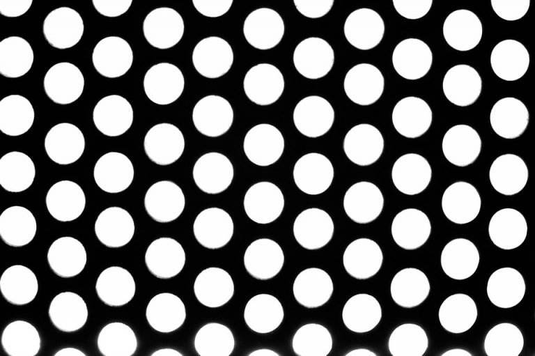
You can also combine two similar colors but with different intensity. The intensity of a color is defined by the amount of color it has. For example, a cyan blue is not the same as a dark blue and a pink is not the same as a magenta. The good thing about this tactic to create contrast is that we can put two equal colors but with different intensity and still contrast. For example, try combining a very dark blue with a very light blue or a magenta with a light pink, and you will see how your eyes notice the contrast they produce. You can also mix the previous tactics with this one, creating a super contrast. For example, imagine combining a very intense red with a very weak blue, it would be something magnificent to see due to the high contrast. - Maximum contrast, black and white: The two colors that have the most contrast are white and black, since they are colors that are simply the opposite and the same at the same time. Actually both colors are achieved by mixing all the colors at the same time, however, the difference is in the light, since white has maximum light and black is complete darkness and therefore no color. As in the example of the dark suit and white shirt, which is synonymous with elegance, black and white always combine as something with maximum contrast, something that of course you can apply to your work to make it stand out as much as possible..